ECharts 怎么安装?
echarts 是js代码 , 本身是属于网页运行的代码 , 平时使用 , 我们只需要把它引入使用即可 .
但是如果你不了解js代码 , 也不明白怎么编辑js代码 , 那么下面这些基础知识 , 希望你能一并了解.
html文件怎么编辑怎么打开?
https://jingyan.baidu.com/article/fedf0737e691b935ad897754.html
如何修改默认打开html文件的浏览器
https://jingyan.baidu.com/article/fec4bce2941232f2618d8b15.html
vscode 下载地址
https://code.visualstudio.com/download
怎么安装vscode
https://guohaomeng.github.io/post/yong-vscode-xie-wang-ye-ji-chu-an-zhuang-pian/
怎么使用vscode编辑html文件
https://cloud.tencent.com/developer/article/1785077
当然如果你是专业人士 , 可以跳过上面的基础知识 .
如果你对源代码进行修改有需要 , 那么也可以去官方开源地址下载对应的源码进行编译 .
源码可以在官网
https://echarts.apache.org/zh/download.html 下载也可以在 github上
https://github.com/apache/echarts/releases 下载
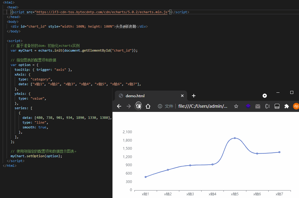
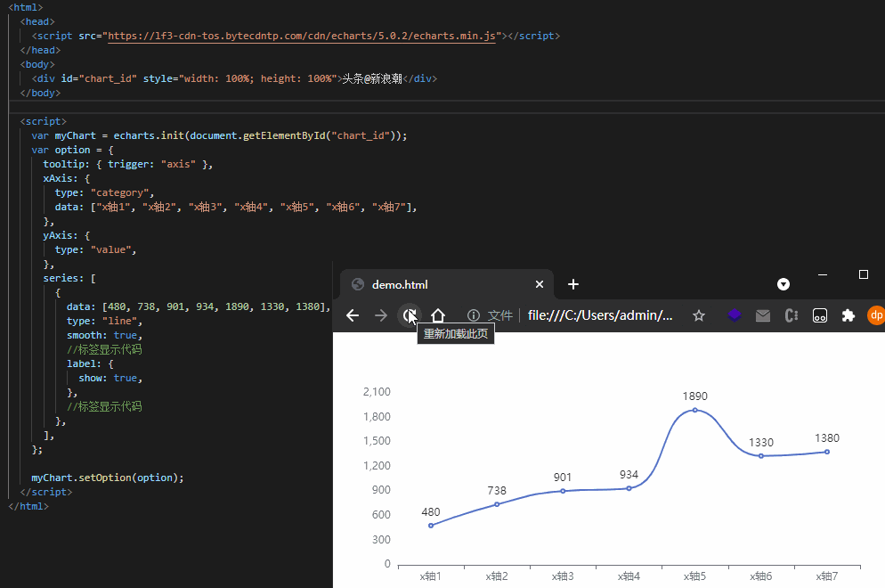
Echarts 折线图教学
通过标签方式直接引入构建好的 echarts
<html>
  <head>
    <script src="https://lf3-cdn-tos.bytecdntp.com/cdn/echarts/5.0.2/echarts.min.js"></script>
  </head>
  <body>
    <div id="chart_id" style="width: 100%; height: 100%">头条@新浪潮</div>
  </body>

  <script>
    var myChart = echarts.init(document.getElementById("chart_id"));

    //option 里面很复杂的项 必须对着官方的配置文档来配置 ,
    //https://echarts.apache.org/zh/option.html
    var option = {
      tooltip: { trigger: "axis" },
      xAxis: {
        type: "category",
        data: ["x轴1", "x轴2", "x轴3", "x轴4", "x轴5", "x轴6", "x轴7"],
      },
      yAxis: {
        type: "value",
      },
      series: [
        {
          data: [480, 738, 901, 934, 1890, 1330, 1380],
          type: "line",
          smooth: true,
        },
      ],
    };

    myChart.setOption(option);
  </script>
</html>

配置表怎么用 , 我举几个常见的例子
例子一 : echarts折线图的点怎么去掉?
思路打开 , 先找到折线的配置项 , 然后去找点的配置项 , 然后把点给隐藏了 .
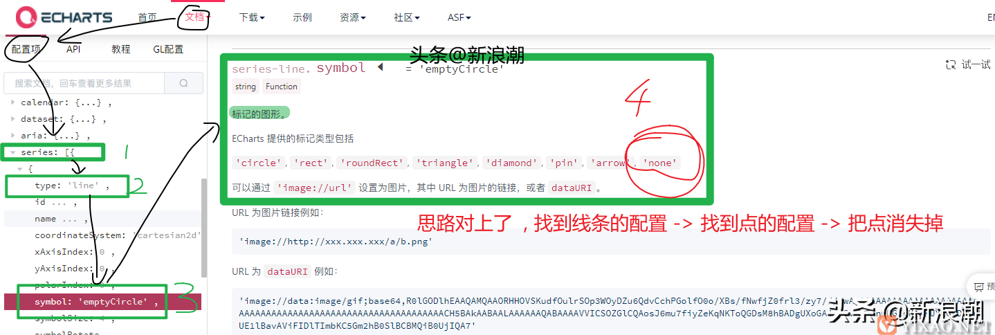
建议放大仔细看
下面落实到实际:
<html>
  <head>
    <script src="https://lf3-cdn-tos.bytecdntp.com/cdn/echarts/5.0.2/echarts.min.js"></script>
  </head>
  <body>
    <div id="chart_id" style="width: 100%; height: 100%">头条@新浪潮</div>
  </body>

  <script>
    var myChart = echarts.init(document.getElementById("chart_id"));
    var option = {
      tooltip: { trigger: "axis" },
      xAxis: {
        type: "category",
        data: ["x轴1", "x轴2", "x轴3", "x轴4", "x轴5", "x轴6", "x轴7"],
      },
      yAxis: {
        type: "value",
      },
      series: [
        {
          data: [480, 738, 901, 934, 1890, 1330, 1380],
          type: "line",
          smooth: true,
          //把点隐藏的代码
          symbol: "none",
         //把点隐藏的代码
        },
      ],
    };

    myChart.setOption(option);
  </script>
</html>
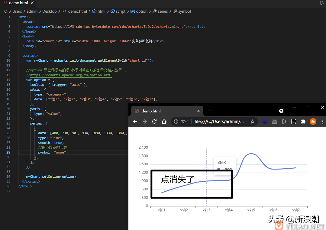
修改了一点点代码 成功把点消灭
例子二 : echarts折线图如何显示数值?
思路打开 , 先找到折线的配置项 , 然后去找标签的配置项 , 然后把标签显示出来 .
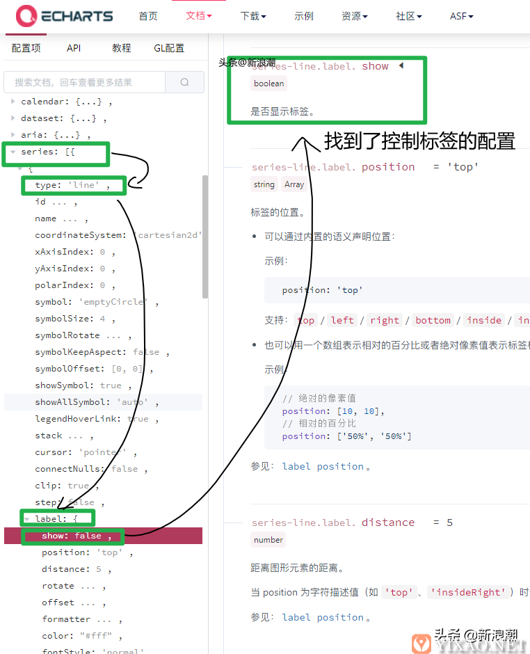
思路对了 一招鲜
<html>
  <head>
    <script src="https://lf3-cdn-tos.bytecdntp.com/cdn/echarts/5.0.2/echarts.min.js"></script>
  </head>
  <body>
    <div id="chart_id" style="width: 100%; height: 100%">头条@新浪潮</div>
  </body>

  <script>
    var myChart = echarts.init(document.getElementById("chart_id"));
    var option = {
      tooltip: { trigger: "axis" },
      xAxis: {
        type: "category",
        data: ["x轴1", "x轴2", "x轴3", "x轴4", "x轴5", "x轴6", "x轴7"],
      },
      yAxis: {
        type: "value",
      },
      series: [
        {
          data: [480, 738, 901, 934, 1890, 1330, 1380],
          type: "line",
          smooth: true,
          //标签显示代码
          label: {
            show: true,
          },
          //标签显示代码
        },
      ],
    };

    myChart.setOption(option);
  </script>
</html>
修改了一点点代码 成功把标签显示出来了
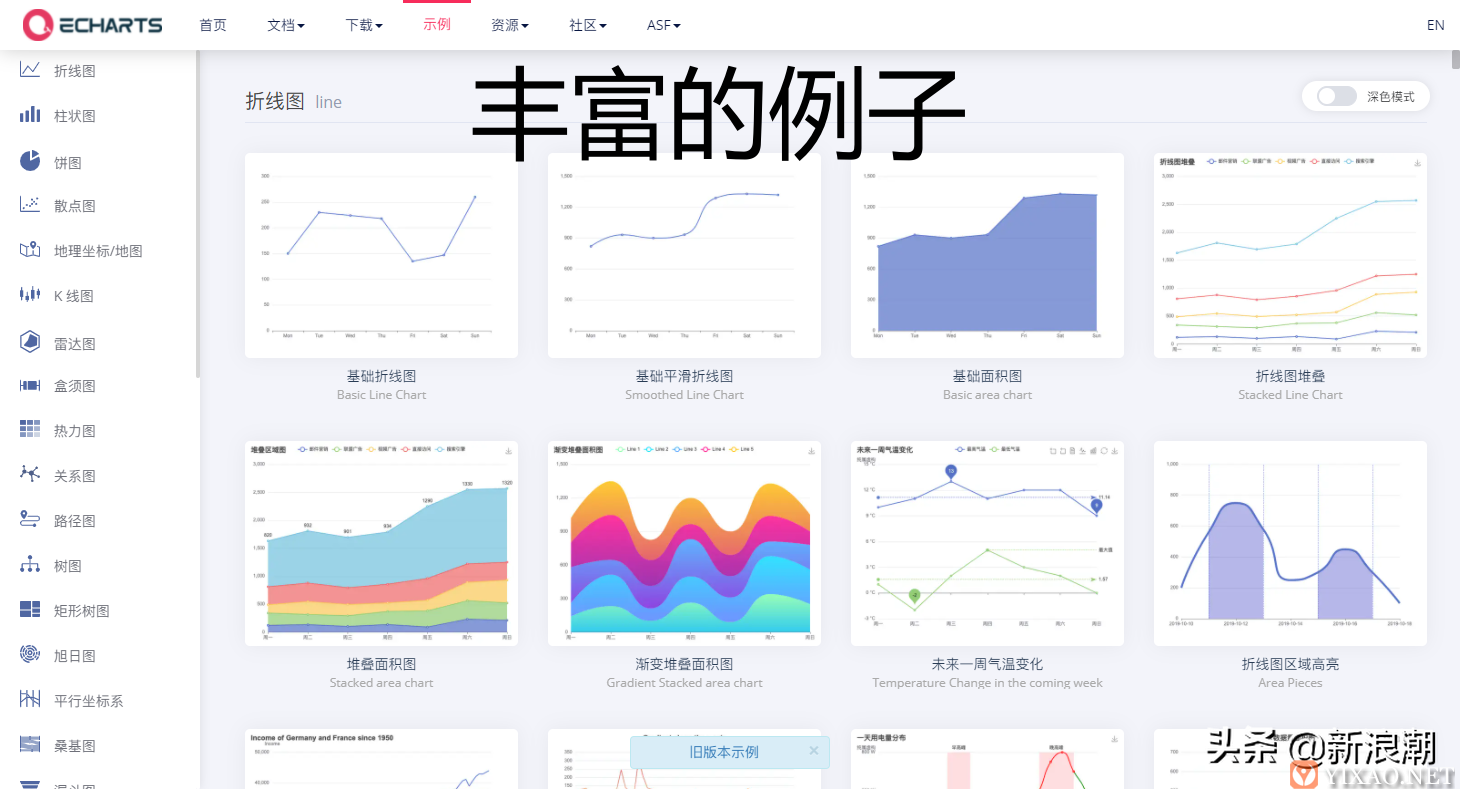
持续学习官方的例子
官方的例子
https://echarts.apache.org/examples/zh/index.html 很丰富 , 也很具有代表性 , 大家也可以在线对官方例子的数据进行编辑 , 可视化其实很简单 , 逐渐摸索慢慢的就会熟悉啦 .
内容出处:,
声明:本网站所收集的部分公开资料来源于互联网,转载的目的在于传递更多信息及用于网络分享,并不代表本站赞同其观点和对其真实性负责,也不构成任何其他建议。如果您发现网站上有侵犯您的知识产权的作品,请与我们取得联系,我们会及时修改或删除。文章链接:http://www.yixao.com/tech/28108.html
 微信扫一扫
微信扫一扫
 支付宝扫一扫
相关推荐
-
Windows10全新任务栏功能更新上手体验
经过一个月的休息,微软终于开始试验Windows 10的新功能。 在Windows 10 21H2 Build 21286下,微软将为任务栏带来一个名为News and Inter…
-
利用Spring的aop原理实现系统级日志管理
背景 日常开发中,我们常用的日志有两种,一种是业务日志,该类型主要用于记录系统中某些业务的变化或属性的改变,比如业务流转过程中记录状态的变化或对象属性的变化,此类型主要用于查询业务…
-
UrBackup数据库备份和恢复之MySQL/MariaDB
下面介绍的所有备份方法都是零拷贝(使用XtraBackup进行增量备份除外)。即数据将直接传输到备份服务器,而不需要先创建本地副本。 创建测试数据库及用户并授权 创建数据库 cre…
-
Vue之MVVM模型和MVC模型
MVC模式的业务逻辑主要集中在Controller,而前端的View其实已经具备了独立处理用户事件的能力,当每个事件都流经Controller时,这层会变得十分臃肿。
-
在Vue中利用Element实现WEB颜色选择器功能
WEB颜色选择器 WEB颜色选择器是一款基于网页格式在线选择颜色色值的工具,在屏幕上看到的任何色彩都是通过红、绿、蓝三原色组成的。这三个颜色通道的变化以及它们相互之间的叠加起来可以…
-
uniapp request封装及使用思想
首先在utils目录下创建一个requset.jsutils/requset.js const request = (config) => { // 处理 apiUrlcon…
-
阿里云CDN网站违规URL屏蔽访问处理方案
今天收到阿里云cdn的通知: 尊敬的****@XXX.com: 您的网站URL:http://XXXX.XXXXX.com/XX/XXX/XXX.apk涉及违法不良信息,违反了相关…
-
15分钟学会高大上的数据地图分析方法
什么都不说,先上一张最终的数据地图效果图,热力图部分是目标用户的分布,紫色和蓝色的购物车表示2种类型的商业购物场所。而深浅不一的蓝色格子块则代表房价。 图1 最终效果图 那么问题来…
-
2500亿,网络安全产业正在成为下一个风口
以新基建为代表的数字化的建设和高质量的发展将引领经济的新一轮增长,这意味着新基建数字化转型已经成为中国未来高质量发展的核心战略的组成部分。但想要保障数字化应用成果,需要的就是网络安全。
-
如何设计B2C商城结算流程?
B2C商城,在对每个商家结算时,必须要直接结算到微信支付宝银行卡,而不能先结算到平台上,之后自行提现吗? 据说这是法律限制,是因为没有支付牌照吗? 如果是这样的话,那么系统的设计是…